Make the offer immediate.
The redesigned opening gives MTa Insights a clear headline, a view of the kit and direct routes to explore it.
 DESIGN. WEB. GROWTH.
A website redesign for experientiallearning.org, bringing the MTa Insights offer, its learning stories and the next action into a clearer digital journey.
VIEW THE ORIGINAL PROJECT ON BEHANCE ↗The page introduces the learning kit, explains how it works, shows it in use, and gives visitors routes to explore the product or get in touch.
SCROLL INSIDE THE SCREEN TO EXPLORE THE DESIGN ↓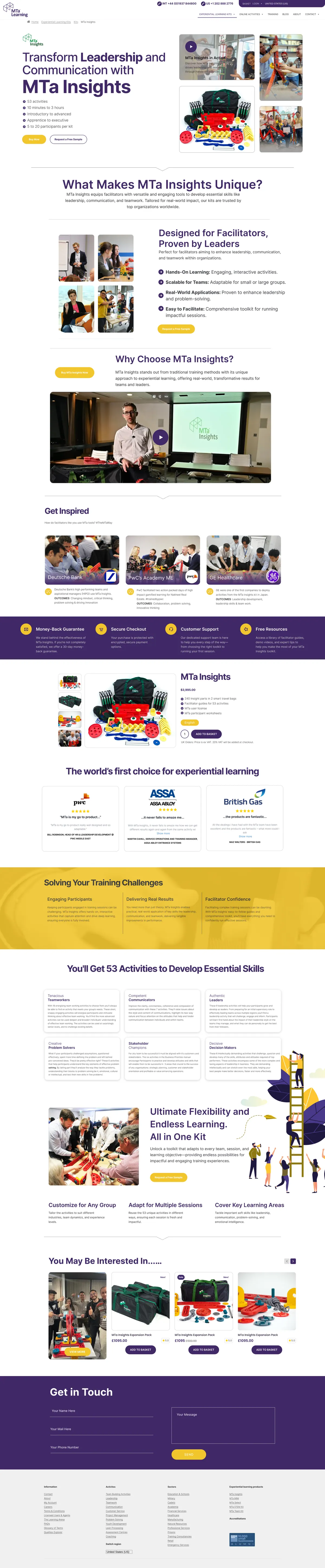
MTa Learning has products, activities, resources and stories to present. The redesign needed a page structure that helps visitors understand the offer, discover supporting detail and find a clear next step.
These choices are visible in the supplied design presentation.
The redesigned opening gives MTa Insights a clear headline, a view of the kit and direct routes to explore it.
Benefits, learning examples, product details and supporting resources sit in distinct sections with a more readable hierarchy.
Calls to action appear alongside relevant content, so visitors can move from understanding the offer to exploring or enquiring.
The published presentation shows the website UI and UX direction, including a stronger content hierarchy, product discovery sections and clearer calls to action.
No traffic, conversion or usability figures were supplied, so this case study describes the design work without claiming measured performance gains.
EXPLORE THE BEHANCE PROJECTTell us what you want to build, improve or put out into the world.